

If you don’t have a natural aptitude for color and design, you may consider web design outside your wheelhouse—but that may not be true! Thanks to color theory, matching your company’s brand identity with the correct color has never been easier.
What is color theory?
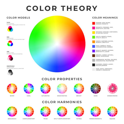
Color theory is the idea that specific colors trigger specific emotions in people. How do you want your company to make people feel? That’s all you need to choose the perfect color theme.
Whole Foods, for example, has a green logo. That choice makes sense because Whole Foods wants to be all about natural, organic food, and green should remind you of nature. McDonald’s, on the other hand, is bright red and yellow, both colors meant to evoke happiness, sunshine, and energy—a Happy Meal hidden in a color scheme. Tesla’s gray logo feels futuristic, simple, logical, just as color theory predicts it should. Before choosing your website’s color scheme, think about what you want your company’s colors to say to the world.
Your company’s color personality
The color you use most in your web design, the dominant color, should relate to how you want your customers to feel about your brand. Take a look at the psychology behind these hues:
- Red: Red is known to arouse feelings of power, love, aggression, and energy. This color is often used by restaurants to stimulate appetites, and for companies like Netflix, Target, Kmart, YouTube, and Coca Cola, that appeal to your urgency and impulses.
- Yellow: Characterized by youthfulness, optimism, and positivity, yellow is often used to catch a customer’s eye, promote clarity, and raise self-esteem. Companies like IKEA, Shell, Best Buy, and Caterpillar use yellow. Though beware, yellow can also cause mental fatigue and eye strain if overused.
- Blue: Known to create a sense of calm, trust, and increased productivity, blue is often associated with companies like DELL, Oral-B, and JPMorgan. This color is also known to support good communication, which is why you’ll find blue throughout social media platforms like Facebook, Twitter, and LinkedIn.
- Orange: As a combination of red and yellow, orange is a high-energy color that often highlights calls-to-action. Companies like Crush, Hooters, Payless, Starz, and Nickelodeon use orange to appear friendly and fun.
- Green: The color of nature, green promotes feelings of health, wellness, and good luck. Companies like Animal Planet, Whole Foods, John Deere, Land Rover, and Tropicana use green to connect their brands to the environment.
- Purple: Related to feelings of spirituality, transcendence, and royalty, purple is often seen in beauty product design, particularly anti-aging products, or in brands that hope to give off vibes of success and wisdom, like Craigslist, Crown Royal, and Hallmark.
Once you’ve decided on your dominant color, make sure your logo reflects this decision, and then you can begin your website design.

Where does color work best?
Color screams for attention, so it’s best not to use it everywhere on your website. Instead, give priority to the important information your customers need to know. Use your dominant color on:
- Your logo
- Menu tabs
- Calls to action
- Titles and headlines
- Buttons
- To highlight current news, sales, or hot topics
Complimentary colors and backgrounds
The major work is done, but not over. Now, you need secondary colors to accompany the dominant color of your web design.
Remember that color wheel from your grade school art classes? Your accent color should be directly opposite the dominant color you chose on the color wheel. Green and orange, yellow, and purple. Easy peasy. Find your color partner.
Complimentary colors should appear in your web design when buttons on your website are pushed, and also to highlight subheads and secondary information.
Also keep in mind that many websites are trending toward using more white space and less color. White space allows products to stand out, and customers to relax and breathe between information bursts. Use color on your site strategically.
As long as you love the color you choose for your logo – your dominant color – and you use that color sparingly, selecting colors for your web design doesn’t need to be overwhelming. You got this!
If you need help choosing colors that will appeal to your ideal audience, the web design experts at Gauge Digital Media can help! Call us today at (410) 376-7709.