

For better or worse, most consumers make some sort of judgment about a website (its products, the brand, and the company overall) within the first 3-6 seconds of having visited. That means that the aesthetics of the site matter significantly: your site has to capture attention, cultivate an interest in its products/services, and help visitors become familiar with your brand within just the first glance.
The website color scheme is a critical component of forming that impression. Psychologists now recognize that color plays a significant role in eliciting an emotional reaction and – when it comes to brands – creating an emotional association. Certain colors can make a consumer feel excited! Or relaxed. Or can fill someone with urgency to make a purchase decision, fast! So it matters very much what you choose when designing a color palette for your website. Here are some of the key things to keep in mind:
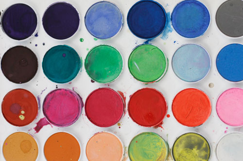
Know the psychology of colors.
Within a culture, we’ve come to associate particular emotions with particular colors. While these associations may not necessarily be universal truths across humanity, within the United States we can say with some certainty that the following are known:
- Blue: evokes trust, confidence, and security.
- Green: is associated with wealth or health/wellness; it often evokes relaxation.
- Purple: soothes, calms. Typically identified as a feminine color.
- Red: evokes energy; increases the heart rate. Elicits a sense of urgency.
- Yellow: evokes optimism, energy, happiness, or youthfulness.
- Orange: feels assertive; can evoke a call to action.
- Pink: evokes romance; typically identified as a feminine color.
- Black: evokes luxury.
So think critically about your brand, your products, and the unique emotions you want your website to awaken in visitors. Is yours a health or wellness brand? Go green. Are you in finance? Choose blue to elicit confidence. It’s okay to choose the colors that others in your industry have chosen previously – color is not necessarily the place where you want to be differentiating (let your messaging or the products themselves do that for you). You’ll also likely have had these same conversations when choosing colors for your logo, so you’ll want to pick coordinating colors that work well with it. And speaking of coordination…
Let the color wheel help you guide your choices.
The human eye likes complementary colors that are most often found opposite each other on a color wheel. So don’t fight it: use that color wheel to inform which colors will work best with your bright green logo. Sites like Colorspire can help you design a color scheme based on the color wheel that’s scientifically proven to work well. The three-ish colors opposite each other on the wheel should (in theory) complement each other well, so start with your core logo color and see what else the wheel points you towards.
Follow the 60-30-10 rule.
Earlier we said “three-ish” colors. That’s because while three really is ideal for a solid website, the web template you’re using might lend itself better to four (and if so, that’s okay). But try not to go above four colors. And if you do stick with three, use the 60-30-10 rule: 60% of your site should be a core background color (lighter is better, so think white, beige, or soft grey), 30% should be a dark font color (black, or navy blue), and the remaining 10% should be your eye-catching, logo-matching color.
Remember your audience.
Stereotypes aside, it has been proven that men and women, older and young generations just tend to have different color preferences. Women will be more inclined to resonate with a brand that relies on purple and pink than men will; they’re less likely to gravitate towards orange. Similarly, younger audiences will have a greater inclination towards yellow than older generations will. So think critically about who your core audience is and what will resonate with them the most, and design your scheme accordingly.
And here’s a thought: if you’ve got a large company and can test a few different schemes with the folks in-house, do it. Present the same website in four or five different schemes and poll the crowd for their favorite picks (and make sure to ask them why). A little market research never hurt anyone when you’re undertaking a big website launch.
Finally, ask the experts.
Unless yours is a web design firm, you’re probably not an expert at choosing website color schemes (and that’s okay). There are plenty of talented folks out there who can do that for you. So give us a call at (410) 376-7709: we’ll be happy to walk you through the science of what works – what doesn’t – and how the right color scheme can best represent your brand.